Product Design • UX Research • Interaction Design
Name the Feeling
A guided emotion categorization app that helps users move from "I feel off" to a specific, named feeling. Designed for low cognitive load during moments of stress.
Role
UX Lead, Team of 5
Timeline
Jan – May 2026
Tools
Figma, user interviews, A/B testing
Type
UX Design, Conceptual / Figma only
Overview
Name the Feeling is a mobile app designed to help users identify and articulate their emotions during moments of stress or confusion. Feelings are often intense, mixed, or simply hard to name. Rather than asking users to pick from a flat list of labels, the app guides them through a layered process: start with something broad, narrow it down, and leave with something specific.
I led a team of five through the full design process, from a PACT analysis and user interviews through paper prototypes, Figma prototypes, and a formal A/B usability study with 10 participants. The project was carried through a complete research and testing cycle in Figma. Every design decision was grounded in real research and tested with real users.
The Problem
People often experience emotions they can't name, particularly in high-stress moments when cognitive capacity is already reduced. Existing tools don't help with this. Mood trackers ask you to pick a broad label or rate 1 to 10. Journaling apps require time and energy you don't have when overwhelmed. Neither supports the harder task of actually identifying what you're feeling.
Our interviews confirmed this directly. Participants described feelings they could sense physically but couldn't put words to, and frustration with tools that only allowed one label when multiple emotions were present at once. The gap wasn't in tracking emotions. It was in helping people identify them in the first place.
Context & Constraints
We conducted a full PACT analysis (People, Activities, Context, Technology) to frame the design space. Key findings shaped every subsequent decision:
Key Constraints
- Users may have limited emotional vocabulary, so the system can't assume psychological knowledge
- Interactions must work during emotional overwhelm: short, low-effort, no long text input
- Used in everyday settings like transit, dorms, and offices, so it needs to be quiet, discreet, and mobile-first
- Tone must be non-judgmental and non-clinical; this is not a therapy tool
- Figma prototype only, no development or real data persistence
Our primary persona, Ji-woo, a 21-year-old student overwhelmed during midterms, anchored every constraint. If the design worked for her, it would work for anyone trying to check in quickly under pressure.
Goals & Success Criteria
Primary goals
→ Help users move from "I feel off" to a specific named emotion in under 2 minutes
→ Reduce cognitive load at each step by presenting fewer, more relevant choices progressively
→ Support emotional complexity by allowing multiple simultaneous selections rather than forcing one label
→ Feel like a check-in, not a form: warm language, no clinical framing, no judgment
Success criteria (tested in A/B study)
→ Task completion time under 90 seconds
→ Cognitive load rated 1 to 2 out of 5 by participants
→ Flow navigable without instruction
Process & Approach
01 — Research: Interviews & PACT Analysis
As a team we conducted semi-structured interviews with participants ranging from students to working professionals. We shaped the research questions around real behavior, not "would you use this?" but "what do you actually do when you can't name what you're feeling?" Participants consistently described needing something fast, low-effort, and non-judgmental, and expressed frustration with single-label mood trackers that didn't reflect their actual experience.
A key early finding: most participants reported experiencing 2 to 3 emotions simultaneously. That made multi-select a design requirement, not a nice-to-have.
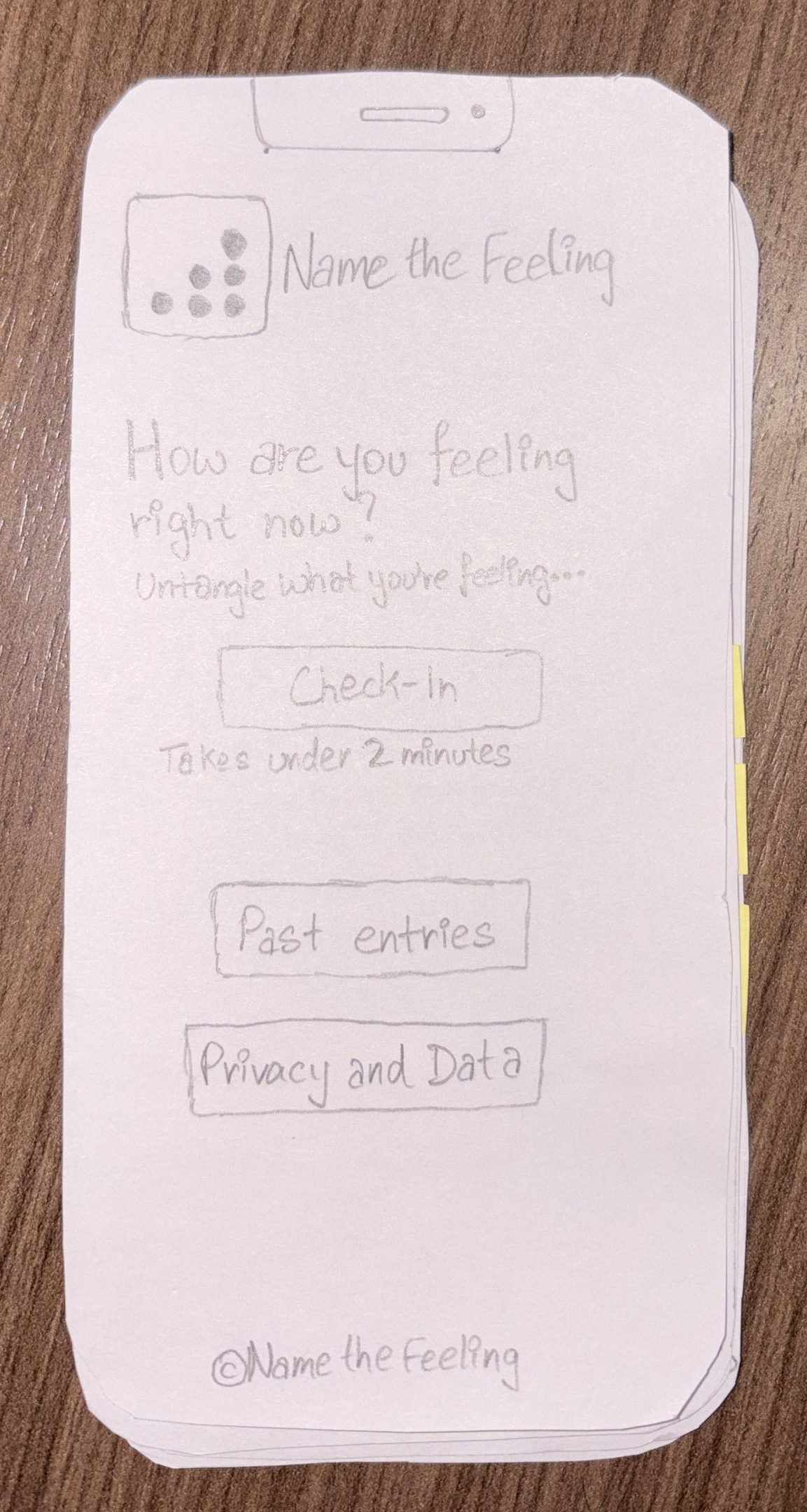
02 — Paper Prototypes & Usability Testing
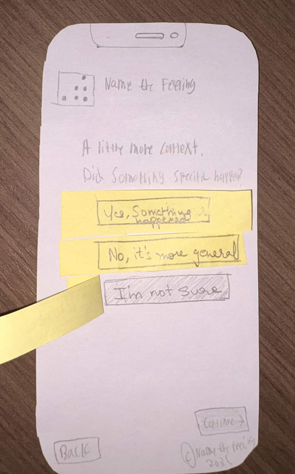
We built horizontal (breadth) and vertical (depth) paper prototypes and ran three think-aloud usability sessions. I observed and took notes while teammates facilitated and operated the screens.
The sessions surfaced clear issues: the emotion category labels were confusing ("Tense or activated" didn't land), the "Did something specific happen?" screen felt unnecessary and slowed people down, and the Check-in and Begin screens read as redundant. I used those findings to drive the redesign, simplifying branching to Good / Bad / Mixed, cutting the context screen, and collapsing the two entry screens into one.
03 — Figma Prototypes & Design Iteration
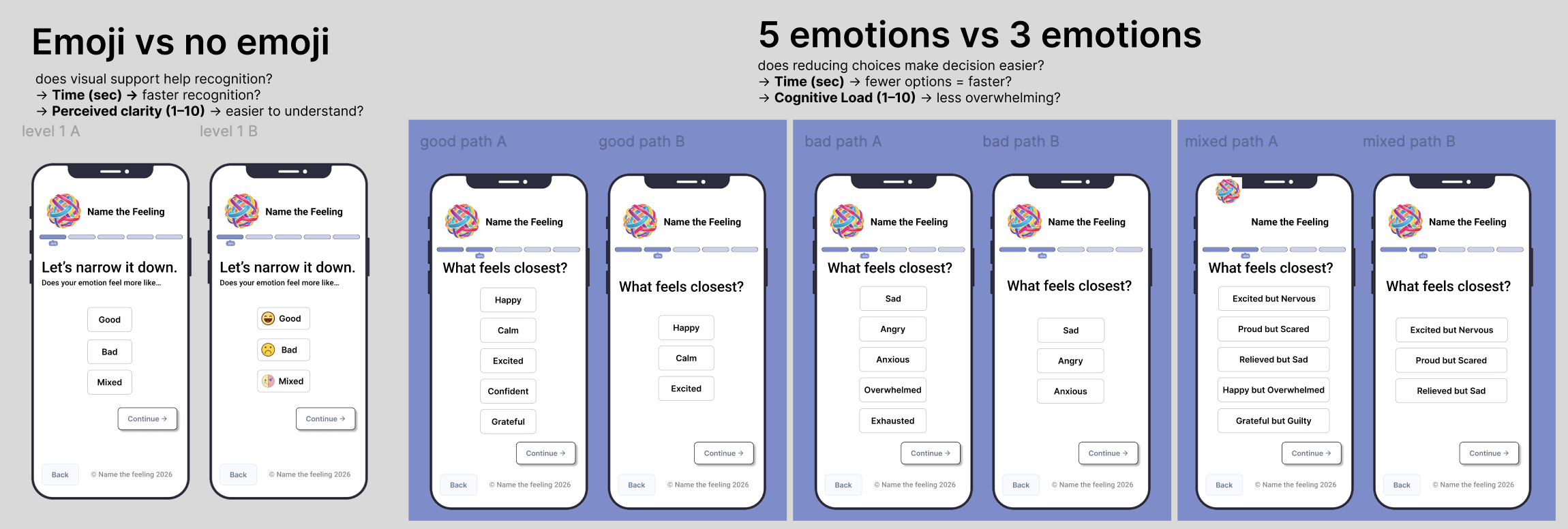
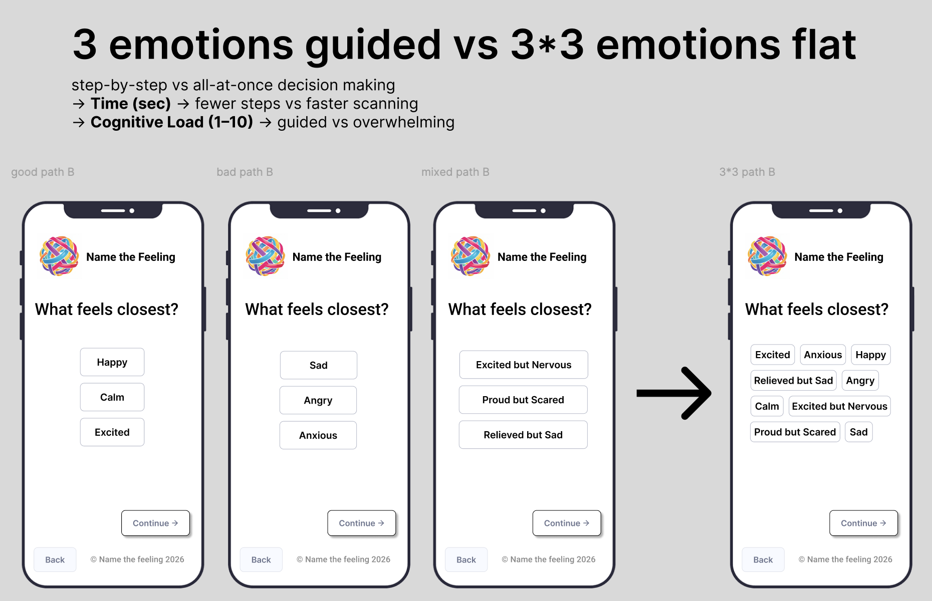
I led the Figma prototyping work and directed the team's visual and interaction decisions. During the design phase we explored several variables, including emoji vs no emoji for emotion recognition and 5-option lists vs 3-option lists for cognitive load. These informed the direction but were not formally tested.
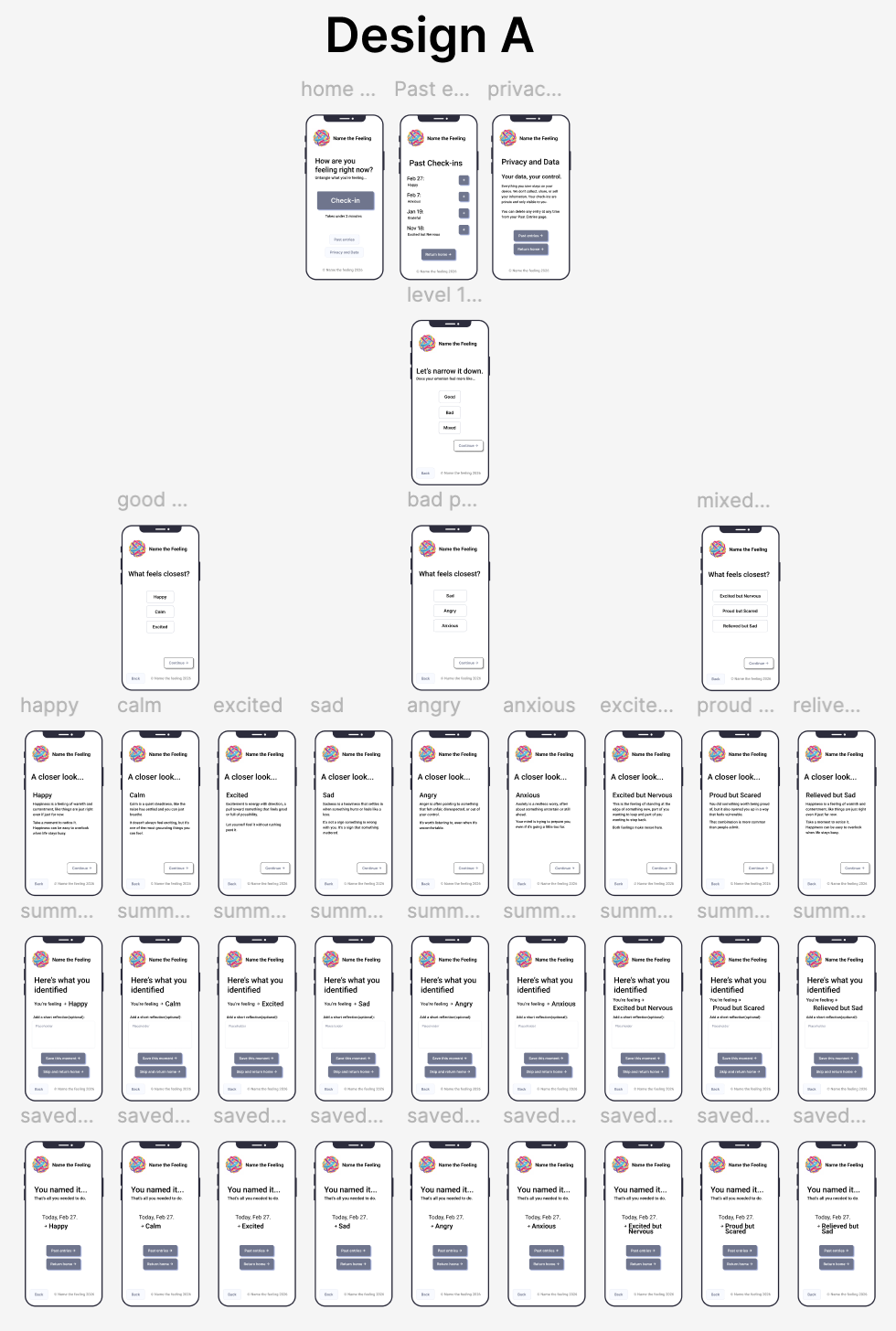
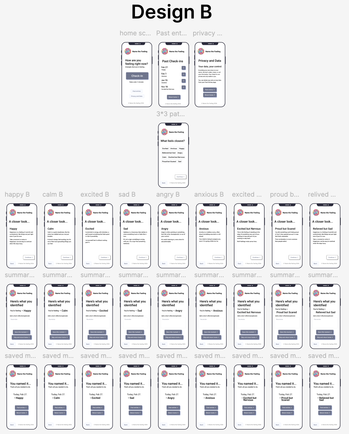
That work produced two distinct designs for the formal A/B test. Design A was guided and step-by-step. Design B presented all emotion options at once in a flat layout.
04 — A/B Usability Study (10 Participants)
We ran a remote A/B study via Zoom with 10 participants split evenly across both designs. I led the results analysis and wrote the conclusions. Each participant completed a timed emotional check-in task and rated cognitive load on a 1–5 scale.
Results
- Design A avg. completion time: 62 sec | Design B: 58 sec
- Design A avg. cognitive load: 1.43 / 5 | Design B: 1.33 / 5
- Difference not statistically significant (p = 0.68 time, p = 0.54 cognitive load)
- Both designs rated as easy, clear, and low-effort by participants
- Most participants selected 2 to 3 emotions simultaneously, validating multi-select as essential
The null result was itself informative. Both interaction styles worked equally well, which meant the choice between guided and flat should be driven by user context and design intent rather than raw performance data.
The Design
Core Flow:
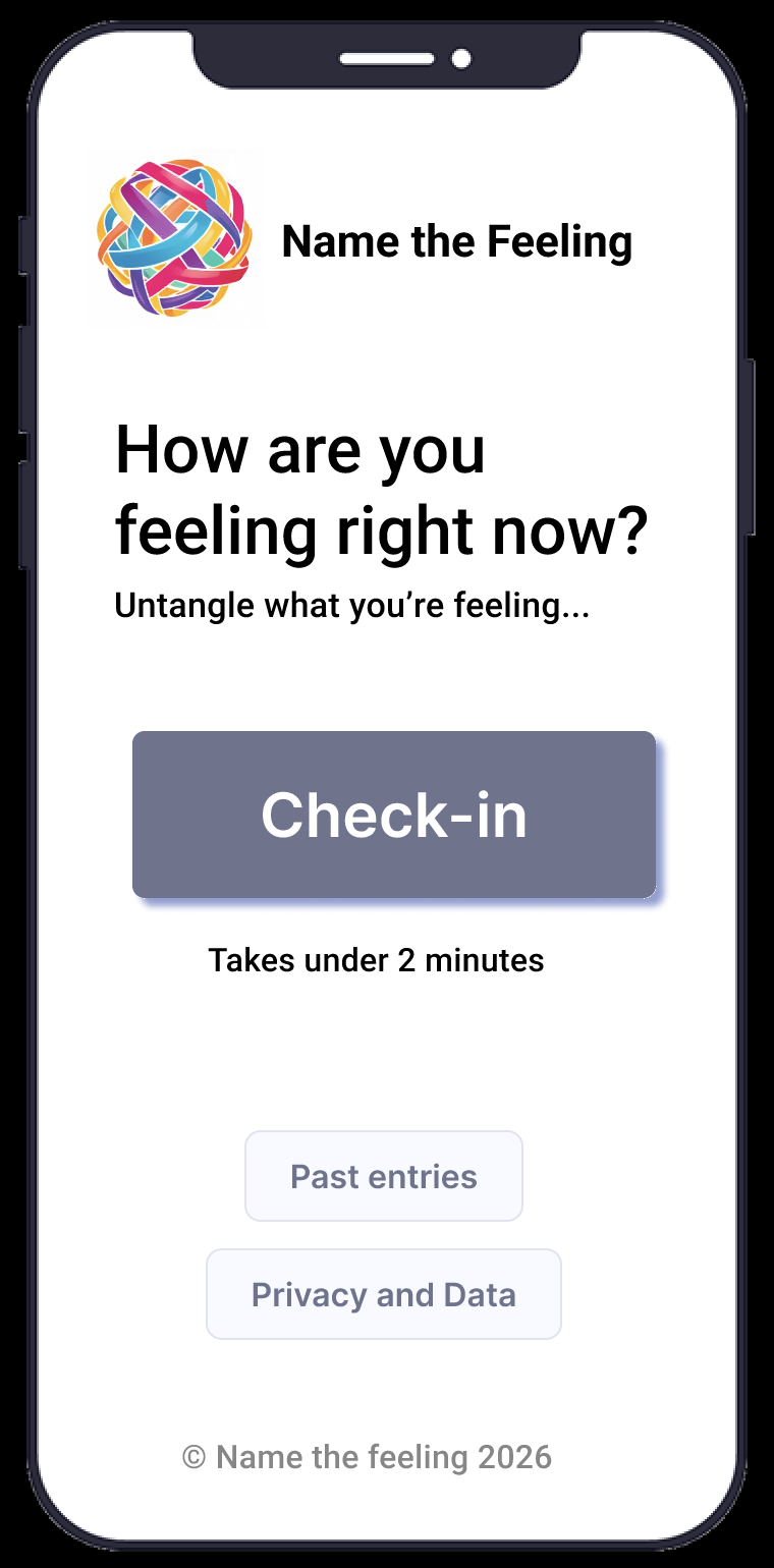
- Home screen: low-pressure prompt: "How are you feeling right now? Untangle what you're feeling..."
- Broad direction: Good, Bad, or Mixed (multi-select enabled)
- Specific emotions: filtered list based on direction selected
- Closer look: brief, warm description of each selected emotion
- Summary: "Here's what you identified" with optional short reflection
- Save or skip: moment saved with date and emotion label for future reference
Key Design Decisions
- Layered emotion architecture: broad direction first, specific labels second, reducing upfront cognitive load at the hardest moment
- Multi-select at every tier: real emotional experience is rarely one thing, and forcing a single label invalidated users' actual experience
- Good / Bad / Mixed branching: replaced abstract categories like "Tense or activated" with intuitive directions users could identify with immediately
- Warm, non-clinical copy: "Untangle what you're feeling" vs "Select applicable emotional states" are functionally the same instruction, but one creates safety and the other creates pressure
- Optional saving: reflection and journaling are available but never required. The core value is clarity, not habit formation.
Outcome
Carried through a full research and testing cycle in Figma. Received full marks across all project milestones including the digital prototype, user testing, and final portfolio reflection.
- Both designs rated easy, clear, and low-effort by all 10 participants
- Task completion averaged under 62 seconds across both conditions
- Cognitive load rated at near-floor levels (1.43 and 1.33 out of 5)
- Multi-select validated: participants consistently selected 2 to 3 emotions simultaneously
The unexpected finding that participants selected multiple emotions simultaneously directly validated the multi-select decision made early in the process based on interview data alone. Research and design aligned.
Reflection
Leading this project taught me that assumptions shift the moment you put something in front of real users. We went in expecting guided step-by-step to clearly outperform flat; users had even said they preferred guided in pre-surveys. The A/B results said otherwise. Both worked equally well, which forced a more honest framing: structure isn't valuable because it's faster, it's valuable because it's more supportive for users navigating complex emotions.
On the leadership side, I learned how to direct a team toward a coherent design without overriding their contributions. Delegating clearly, research to the interviewers, facilitation to the testers, prototype screens distributed across teammates, meant everyone had real ownership and the work was stronger for it.
What I learned
- Information architecture is not neutral: how you structure choices shapes what feels possible
- The language in your prompts is part of the design. "Untangle what you're feeling" and "Select applicable emotional states" are the same instruction, but one creates safety and the other creates pressure.
- A null result in user testing is still a result worth communicating clearly and confidently
What this shows
- I can lead a full UX process from research through testing
- I can synthesize findings into principled design decisions
- I can build a team that contributes meaningfully without losing the thread of what actually matters to the user
If I rebuilt this today
- Run usability testing with a larger, more diverse participant pool to get statistically meaningful results
- Explore a richer emotion categorization system: the Good/Bad/Mixed branching works but loses some nuance for complex emotional states
- Design a version for users in acute distress with even simpler interaction requirements